Thursday, 1 October 2015

A visita inspiradora na Casa Cor

Ontem tive a oportunidade de visitar a exibição de desenho de interiores, a Casa Cor. Gostei muito dessa mostra!

Dessa vez a Casa Cor está localizada na Vila Aymoré na Gloria. A Vila Aymoré é um groupo de casas que foram construídas entre 1908-10 como moradia de alto padrão para burguesia da época. Depois de algum tempo o local perdeu a fama e estava abandonado. Alguns anos atrás começaram o trabalho para renovar o local para virar um centro de escritórios. Antes da inauguração o local ficará como sede da exibição Casa Cor até outubro.

Vila Aymoré é um lugar bem lindo! É uma fileira de casas antigas amarelas decoradas com ornamentos de época pintados de branco. As casas têm quartos com tetos muito altos e alguns deles tem paredes de pedras descobertas. Um lugar maravilhoso. Amaria morar lá.

Fiquei muito inspirada com essa visita. Acho que minha impressão da mostra não seja totalmente imparcial. Logicamente você presta atenção nas coisas das quais você tem interesse. Eu tirei algumas fotos das coisas que gostei, mas se você quiser uma visão sem minha edição aqui tem link para as fotos de todos ambientes da mostra.

O que eu gostei?

1) Cor: Acho que isso não é uma surpresa para vocês. Ultimamente cor já é um tema continuo. Na exibição gostei muito de algumas paredes pintadas. Estou tentando convencer  meu marido de pintar uma parede do escritório dele em azul marinho. Acho que ficaria legal. Porém, ele ainda não está convencido.

Em geral não gosto de azul. Ultimamente estou ficando mais receptiva para a cor. Gostei muito do ambiente da arquiteta PaolaRibeira, chamada Living da praia, que tinha algumas paredes pintadas de azul marinho com móveis em branco e cores vibrantes. 
Amei também o trabalho da paisagista PaulaBergamin que desenhou o jardim da Frida Kahlo. O espaço foi inspirado por uma das minhas artistas favoritas e casa dela no México.  Eu gosto muito dessa cor de azul elétrico mas não é uma coisa que veria na minha casa. É um pouco de mais.
2) Texturas nas paredes: Em geral não sou muito fã de papeis de parede mas gosto muito das paredes pintadas com textura. Gostei muito dessa parede cinza com efeito cimentício que é parte do ambiente dos arquitetos André Piva e Vanessa Borges. Achei também essa parede coberta em tecido muito interessante (projeto da Marina Linhares). Essa não é uma coisa para nossa casa mas acho linda.
3) Cortinas arrenegadas: Já vi esse efeito usado em algumas paredes pintadas e gostei muito. Nas cortinas o mesmo efeito ficou lindo demais (projeto de Gisele Taranto). 
4) Balanços: Acho que ter uma rede deveria ser um direito humano. Balanços também.  Gostei muito dessa balaço tipo sofá no jardim de Adriana Fonseca. A Gisele Taranto também colocou um balanço no projeto dela mas infelizmente não tenho a foto.
5) Água corrente: Estou sonhando em ter um jardim ou terraço pequeno cheio de flores e plantas com água corrente. Nada é mais relaxante do que som de água corrente. Claro que vou matar as flores e plantas de mal-cuidado mas sempre podemos sonhar. Gostei muito das torneiras de cobre usadas na varanda de Darcy Brouck e Jairo de Sender  e a piscina que Paula Bergamin colocou no jardim da Frida Kahlo.
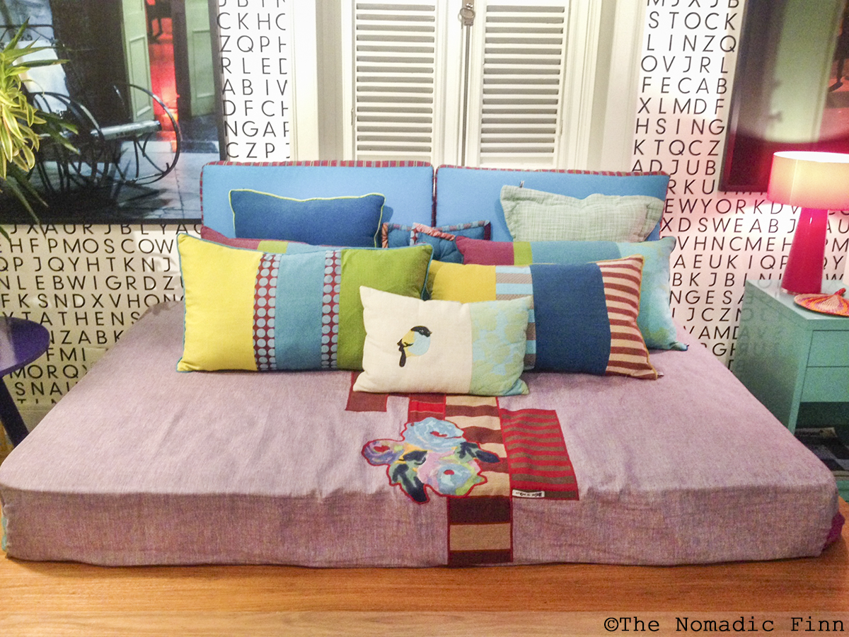
6) Sofá-cama…não agora é cama-sofá: Gosto muito do novo conceito (para mim) de transformar uma cama em um sofá na sala de estar como no projeto do Pedro Paranaguá. Quero um desses para nossa casa, mas um pouco mais estreita. Depois vou enche-la com muitas almofadas.
7) Almofadas, mais almofadas: Sou totalmente fiel aos benefícios de ter almofadas decorativas. Acho que almofadas decorativas tornam o espaço convidativo. Para mim, em se tratando desse assunto, acho que mais é realmente mais.
8) Arte nas paredes: Acho que as paredes cheias finalizam a decoração. Fiquei muito impressionada com arte em todas as ambientes na Casa Cor. Amei as fotografias grandonas, impressões e pinturas. Quero isso para minha casa.

A Casa Cor está aberta até 13 de outubro de 2015. Se você tiver a oportunidade, definitivamente  vale a pena visitar!


------

Yesterday I had an opportunity to visit an exhibition of interior design, Casa Cor. I really liked the show.

This time Casa Cor is taking place in Vila Aymoré in the neighborhood of Gloria in Rio de Janeiro. Vila Aymoré is a group of houses built between 1908-10 as high level accommodation for the bourgeoisie of the time. After some time the location lost the fame and was abandoned. Some years ago work was started to renovate the location and turn it into a group of offices. Before this, the location will host this years exhibition of Casa Cor until October.

Vila Aymoré is really pretty place! It consists of a row of old yellow houses decorated with ornaments of the period painted white. The house have rooms with really high ceilings and some of them have bare stone walls. Really marvellous place. I would love to live there.
I was really inspired by the visit. I think my impression of the show might be a bit partial as logically you pay attention to those things you find interesting. I took some pictures of things I liked but if you want unedited vision of the show here is a link to photos of all the exhibition spaces.

What did I like?

1) Color: I think this might not be a surprise to you. Lately color is already a continuous theme. In exhibition I liked some of the painted walls. I am trying to convince the husband to paint one of the walls of his office in navy blue. I think it would look great, however he is not that excited.

In general, I don't like blue. Lately, though, I have become more receptive of the color. I really liked the exhibition space of architect Paola Ribeira, called Beach Living, which has some walls painted in navy blue with furniture in white and vibrant colors.
I also loved the work of landscape artist Paula Bergamin who designed the garden of Frida Kahlo. The space was inspired by one of my favorite artists and her home in Mexico. I like the electric blue she used but it's not something I'd see in our home. I think it's a bit too much.
2) Texture on the walls: In general, I am not a big fan of wall paper but I like painted walls with texture. I really liked this grey wall with its cement finish that is part of the space designed by architects André Piva and Vanessa Borges. I also liked this fabric covered wall interesting (project of Marina Linhares). It's not something for our place but I think it's very pretty.
3) Ombre curtains: I already saw the ombre effect used in some painted walls and really liked it. In curtains this effect came out really nice as well.
4) Swings: I think hammocks should be a human right. Swings as well. I really like this sofa swing in the garden designed by Andriana Fonseca. Gisele Taranto had a swing in her design as well but unfortunately I don't have a photo of it.
5) Running water: I am dreaming of a small garden or terrace full of flowers and plants with running water. Nothing is more relaxing than the sound of running water. Of course I'd kill the plants and flowers for not managing to take good care of them but we can always dream. I really liked the copper taps that were used in the terrace of Darcy Brouck and Jairo de Sender and the pool Paula Bergamin placed in Frida Kahlo's garden.
6) Sofa bed… now it is bed sofa: I really like this new concept (for me) of turning a bed into a sofa in the living room like in the project of Pedro Paranaguá. I'd like to have one of those in our flat and then I would cover it in cushions.
7) Cushions, more cushions: I am totally a believer of the benefits of having decorative cushions. I think they turn the space into more inviting. In regard to this topic, I think more is really more.
8) Art in the walls: I think full walls finalize a decoration. I was very impressed with the artwork in show in all the spaces of Casa Cor. I loved the large photographs, prints and paintings. I really want this for our house.

Casa Cor is open until 13the October, 2015. If you have an opportunity, it's definitely worth a visit.

Monday, 28 September 2015

Cor, rísco ou oportunidade?

Acho que já falei, que aqui no Brasil nas revistas e blogs de interiores frequentemente você pode ver paredes pintadas com cores vibrantes, e que as acho muito inspiradoras.

Ultimamente estou pensando bastante sobre cor.  Quero pintar algumas paredes em nossa casa. Já estou pensando nisso desde quando nos mudamos aqui mais do que dois anos atrás, mas não estou conseguindo decidir com que cor quero pintá-las. 
Foto achada de blog Cote de Texas pela fotógrafa Fran Brennan

Em nossa casa em Atenas nós tínhamos algumas paredes coloridas. Na sala de estar tínhamos uma parede marrom esverdeada escura que era perfeito. Amo essa cor. No hall a parede era pintada de vermelho que não funcionou. No quarto a parede era pintada de cinza mas não teve o impacto que queria. Que bom, uma das três tentativas ficava sucesso.

Eu aprendi algumas coisas com essas tentativas de introduzir cor em nossa casa.  As cores têm que ser bastante escuras para fazer um impacto. Percebi que nas amostras que você ve nas lojas vendendo tintas, a cor parece mais escura mas na parede que é maior a cor fica diluída. Isso aconteceu com a parede cinza do quarto. Achei que estava pintando a parede cinza relativemente escuro mas durante o dia quase não consegui perceber que a parede não era branca.
Foto achada de blog 79ideas pela fotógrafa Kristiina Kurronen, styling Susanna Vento

A cor da luz muda a cor da parede. Se sua iluminação é tungsténio (luz amarelada) ou você usa as lâmpadas para economizar a eletricidade (luz branca) isso afeta como você percebe a cor.  Também a cor da parede fica mais vibrante se a tinta tem um pouco de brilho. Para mim a melhor tinta para as paredes coloridos é tinta de meio brilho/ cetim. Esse tipo de tinta reflete luz sem ter cara de máquinas industriais.


Para mim a dificuldade com a seleção de cor é que quero impacto, quero cor vivida mas não quero que as cores confrontem entre si e os móveis que já temos. Quero uma casa harmônica mas divertida. E isso é bem difícil. Acho que por causa disso muitas pessoas acabam decorando com branco e cinza. São cores que combinam com tudo, são elegantes mas ao mesma tempo são talvez um pouco seguros demais. Acho que a cor é uma estratégia de alto risco, alto retorno. Pode ficar bem ruim, mas quando fica bom, fica uma maravilha.
Foto achada de pagina Tidbits & twine, fotógrafo desconhecido
-----------------------
I think I already spoke that here in Brazil in interior magazines and blogs you often can see walls painted in vibrant colors, and that I find it really inspiring. 

Recently I have been thinking quite a lot about color. I want to paint some walls in our home. I have been thinking about this since we moved here more than two years ago, but I can't decide with which color to paint them.

In our flat in Athens we had some colorful walls. In the living room we had a dark greenish-brown wall that was perfect. I loved that color. In the hall we had a wall painted red which didn't function at all. In the bedroom the wall was painted grey which didn't really give the impact I wanted it to. Quite good after all, one out of three ended up a success.

I learned some things with the attempts to introduce color to our flat. The colors have to be dark enough to give impact. I noticed that in the samples that you see in the paint shops the color looks darker but on the wall it looks diluted. This is what happened with our grey wall in the bedroom. I though I painted the wall mid-grey but during the day I almost couldn't make the difference if the wall was white or not.

The color of the light also changes the color of the wall. If the lighting you have is tungsten (yellow light) or if you use lamps saving electricity (white light), this affects how you see the color. Also the color looks more vibrant if the paint you use has some shine. I prefer half-shiny/ satin paint for colorful walls. This kind of paint reflects light without making the wall look like industrial machine.

What is difficult with the color selection is that I want impact, I want vibrant colors but I don't want the colors to clash with themselves or with the furniture we have. I want a home that is harmonious but still fun. It's quite difficult. I think for this reason people end up decorating with neutral colors like white or grey. They are colors that combine with almost anything, are elegant but the same time maybe a little too safe. I think color is a high risk, high return strategy. It can come out really ugly, but when it works out it will really look fabulous.

Friday, 31 July 2015

Pão de banana 2.0

Hoje fiz uma nova versão de pão de banana que já publiquei aqui algum tempo atrás. Desta vez ficou ainda melhor! Acho que temos o vencedor.

Eu usei a receita de pão de banana inspirada pela minha colega Soo como base, mas a mudei um pouquinho. Ao invés de usar só farinha de trigo eu usei uma xícara de farinha de trigo e meia xícara de aveia em flocos. Também adicionei uma xícara de nozes e um pouco mais de gengibre em pó. Ficou muito bom! Já comi quatro pedaços! Tchau para os resultados da dieta de desafio
…
Aqui a receita de novo com as mudanças.

Pão de banana

½ x. de azeite de oliva
1 ½ x. de açúcar mascavo
2 ovos
4 bananas maduras
1 x. de farinha de trigo
½ x. de aveia em flocos
1 c. de chá de bicarbonato de sódio
½ c. de chá de sal
½ c. de chá de açúcar com baunilha
1 c. de chá de canela
1 c. de chá de gengibre (em pó)

Misture o azeite e o açúcar numa tigela. Misture os ingredientes secos (farinha, aveia, bicarbonato de sódio, sal, baunilha, canela e gengibre) numa outra tigela. Esmague as bananas. Coloque as bananas e os ingredientes secos na tigela com azeite e açúcar. Misture. Bata os ovos e depois adicione na massa. Adicione os nozes e misture. Coloque papel manteiga numa fôrma. Derrame a massa na fôrma. Asse no forno de 180c por 45-60 minutos. 
 
Digas:
- Para o bolo subir bem, você tem que esquentar o forno ao máximo, coloque o bolo no forno, deixe só por um pouco de tempo para a massa subir (3-5 minutos) e depois abaixe na temperatura da receita e asse até o final do tempo indicado.